Pantaloons
A homepage UX audit and redesign concept for clearer fashion discovery.
More discovery.
- Project type
- Independent redesign concept
- Scope
- Homepage experience
- Methods
- Heuristic review · Benchmarking
- Deliverable
- Figma interaction prototype
Make discovery feel less demanding.
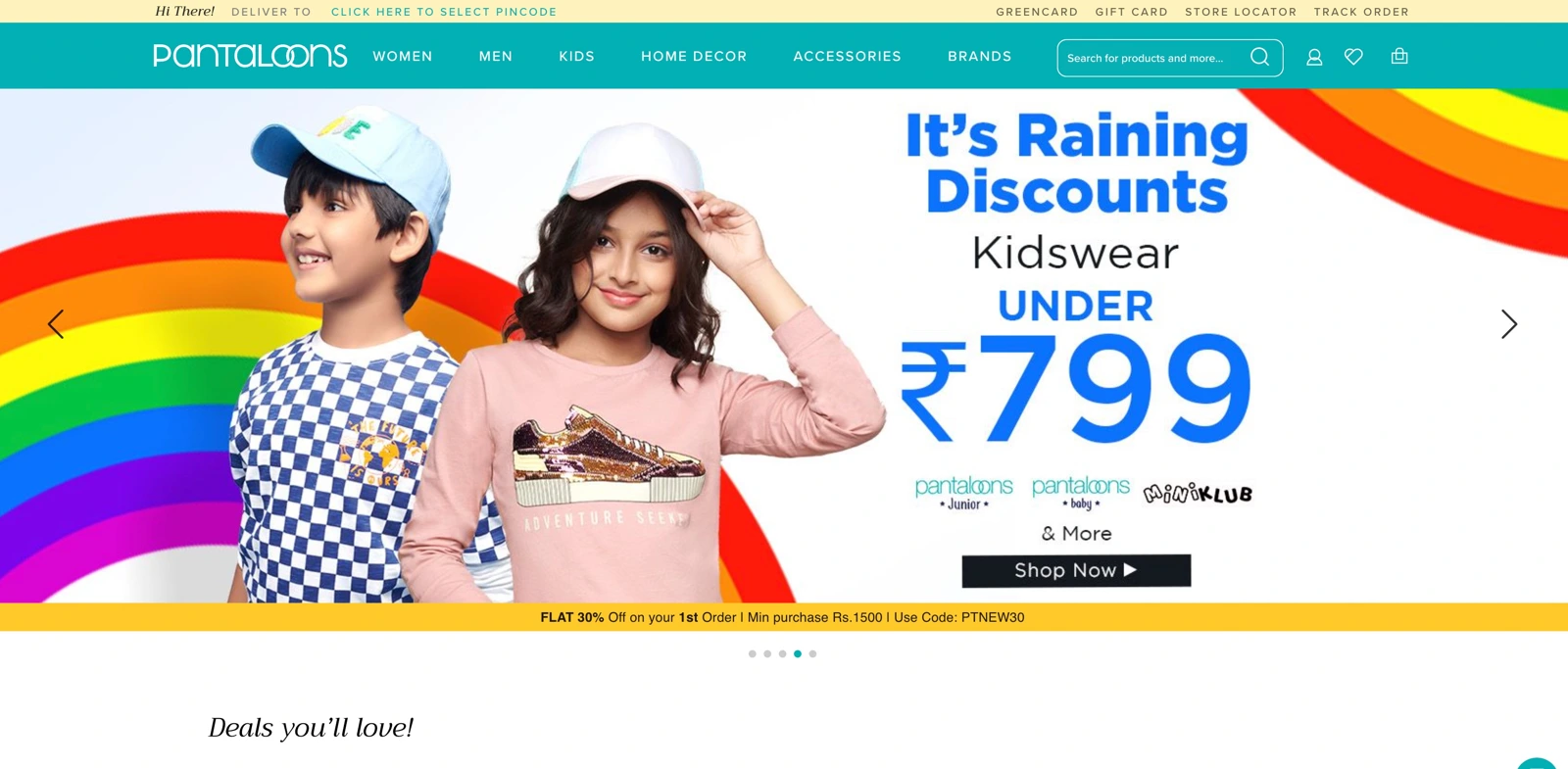
This independent case study examined the Pantaloons homepage and proposed a refresh focused on clarity, consistency and easier product discovery. The scope was the homepage experience and a Figma interaction prototype.
I reviewed the site using usability heuristics, spoke informally with friends, former colleagues and relatives who shopped with Pantaloons, and compared patterns across other retail experiences.
This was a redesign concept, rather than a commissioned or shipped Pantaloons engagement. The audit describes the website captured in the original study, not its current state.
When everything competes, nothing leads.
The review found competing promotions, repetitive information and inconsistent visual patterns. Some interactions introduced unnecessary effort; others made product availability or the next step unclear.
- Information overload: multiple offers and dense banners competed for attention.
- Interaction friction: the cart preview required an extra dismissal step.
- Unclear discovery: mismatched filtering cues and incomplete product information could confuse shoppers.
- Visual inconsistency: card dimensions, typography, alignment and CTA treatment varied across the page.
- Accessibility concerns: some text and backgrounds had insufficient visual contrast.
Give the page a clearer rhythm.
Familiar structure
Use a recognisable e-commerce layout, intuitive navigation and a clearer hierarchy to reduce the effort needed to understand the page.
Consistent visual language
Align typography, card styles, padding and CTA affordances, while retaining colours drawn from the existing brand.
Make more content discoverable
Avoid a false bottom. Use horizontal product browsing where appropriate and make continuation below the first fold more apparent.
Clarify what can be shopped
Propose product hotspots for “Shop the look”, with details available in context. The concept aimed to make available items clearer before adding extra clicks.
From critique to an interaction proposal.
The Figma concept explored a hero slider, horizontal product browsing and product-image interactions. Add-to-cart, wishlist controls and product hotspots were described as intended behaviours for development.
The study documents a proposed direction. It does not claim conversion gains, completed usability validation or production implementation.
Consistency helps people make decisions.
This project strengthened the connection between visual craft and usability: hierarchy, spacing and interaction consistency shape how easily someone can understand an offer or choose a product.
The next step would be to validate the proposed hierarchy and browsing patterns with shoppers, including keyboard and assistive-technology users, before drawing conclusions about impact.
Clarity is a design decision at every scale.